The Psychology of Percentages
TL;DR
Percentages make proportions easier to compare, yet they can hide the people or units behind a statistic. The article uses a hypothetical group of 100 to restore that scale, while warning that a simple analogy cannot explain every part of a complex issue.
- Why it matters: A percentage becomes clearer when readers also know the whole group and the real unit being counted.
- How it works: Translating a share into a count can make an abstract comparison easier to picture and discuss.
- Case in point: A one-hundred-person scenario turns a proportion into a small group that readers can imagine.
- Reality check: The simplification can illuminate one pattern while leaving out causes, context and differences within a population.
We are all familiar with percentages: we learned about them in grade school and we encounter them everywhere. The concept of abstracting a quantity to a common range can be extremely useful. Percentages let us compare relative quantities of groups, measure changes in quantity over time, we use them in how we calculate interest, to measure slope, and in any number of other ways. By far, the most common use of percentages is to indicate a portion of a whole. Despite their advantages, percentages add a layer of abstraction that can depersonalize data. It’s hard to conceptualize percentages and translate them to quantities of real units, especially when the actual quantities are very large. For example 19% of the world’s population lives in China. But since this number has been abstracted and the unit of “People” has been removed, we don’t have much of a personal connection to the statistic. An alternative way of conceptualizing the same numbers would be to create a hypothetical scenario. If the world were 100 people, China would have 19 people in it. This returns the intimacy to the numbers. Now we can have thoughts like, “I know that many people”, “My extended family is that big”, or “That’s fewer than the number of kids in my third grade class.” These types of thoughts can help us empathize with other issues involved in the data: important issues like the number of people going hungry, or literacy rates, or wealth distribution. Let’s take a look at how effective this technique can be. If the World Were 100 People looks at some global statistics using this hypothetical situation. Remember, you could put a percentage sign on the end of all of these numbers and they would still be accurate.
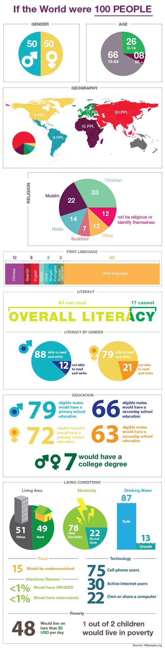
That’s pretty effective. 17 people can’t read, and only 7 have a college degree! 13 have unsafe drinking water. That’s a small enough number that I feel like I could help them by myself. It really makes you wonder why conditions like this still exist if the relative quantities are so low. This technique definitely returns the human scale and empathy to these numbers. It can be even more effective when used to point out a group of people causing a problem. Wealth Inequality in America transitions to this 100 people technique at about the two minute mark, but at about four minutes thirty seconds, it uses it to callout an individual. That individual represents the top 1%. But when it is phrased as 1%, the effectiveness is gone. It’s an amorphous blob of an unknown quantity. But, when it’s one person, phrased as “this guy,” it becomes far more powerful. That’s a guy I could speak my mind to. I could show him the conditions people live in, struggling to make it. I could have a beer with him, and an honest conversation.
Honestly, this whole “100 people” trick works way beyond just international stats. If you’re stuck trying to explain a big, faceless number—say, 5% of a city is uninsured, or 18% of students skip breakfast—shrinking it to a single classroom or a subway car can turn that dry statistic into something that sticks. Suddenly, it's not “some people”—it's Paul, and Sam, and even maybe your neighbor’s kid. It’s probably why teachers fall back on this in math class; you’ve got to make the math tug at your sleeve a little, remind you that numbers start as humans. I’m convinced that, for a lot of us, abstract data only matters when it jumps off the chart and sits next to us at dinner.
At the same time, there’s a sneaky risk that this “people out of 100” translation can oversimplify things. Complex, messy problems don’t always behave well in tidy proportions, and there’s a danger in believing the whole story fits neatly into 100 hypothetical characters. Take inequality—sure, picturing one guy with a giant pile of cash versus everyone else drives the idea home; still, it can hide the structures and policies behind the scenes. The world isn’t actually a tiny village, even if imagining it helps. This is where you want to keep a healthy skepticism, and maybe remember that real change usually needs more than just good analogies.
The power of this hypothetical situation is a good thing, and the examples above use it for good purposes. It is a good way to return emotion to statistics, but like all powerful things, it should be used with caution. Overuse could do more damage than good. It’s a technique that should be considered carefully before being employed. Drew Skau is Visualization Architect at Visual.ly and a PhD Computer Science Visualization student at UNCC with an undergraduate degree in Architecture. You can follow him on twitter @SeeingStructure
Frequently Asked Questions
How do you turn a percentage into a real-world count?
Start with the total group, convert the percentage into its decimal form, and multiply it by that total. State both the percentage and the resulting unit so readers can see what the comparison represents. The article uses a hypothetical group of one hundred people because the translation becomes easy to picture without changing the underlying proportion.
When is a one-hundred-person analogy useful?
It is useful when a large or abstract proportion prevents readers from picturing who or what is affected. The article uses the approach to make global statistics feel closer to a human scale. Use it as an explanatory aid, then keep the original denominator and source available so the reader can understand the actual scope.
What can go wrong when simplifying data with percentages?
A simple scenario can hide variation, causes and uncertainty behind a statistic. The article cautions that complex problems do not always fit neatly into a group of one hundred hypothetical people. Pair the analogy with the original context, the population being measured and any limits that affect how the number should be interpreted.

Read more
-
Marketing
From Meta to Cara: Where Artists Reclaim Their Creative Freedom
What Is Cara? “Cara is a social media and portfolio platform for artists.” Straightforward, right? That’s how they define themselves on Cara’s “about” page. In response to the spread of generative AI, Cara aims to filter out AI-generated images, providing a space where genuine human creativity can be easily found and appreciated. The platform (in […]
-
Marketing
Reddit: Why You Should Keep an Eye on This Ever-Growing Platform
Discover why Reddit is the go-to platform for real-time insights and discussions. With a unique community-driven structure, Reddit offers a space for users to explore diverse topics. Learn how the Google-Reddit deal enhances its influence and what it means for marketers in our in-depth analysis.
-
Marketing
Interactive Product Demo: The Selling Power Behind the Strategy
A good interactive product demo is an impactful way to interest consumers in your best products. Here’s a closer look at what today’s marketers need to know to get them just right.