The Dangers of Scale: Visualizing the Hills of Bay to Breakers
TL;DR
Elevation charts can make a steep running course look gentle when the vertical scale is compressed. This Bay to Breakers account compares route tools and shows why a runner should inspect climb details and route distance before trusting one polished graphic.
- Why it matters: A distorted scale can lead a runner to underestimate the effort required on a short climb.
- How it works: The chart shape changes when a tool expands or compresses elevation relative to route distance.
- Zoom in: The article found that the hardest climb lasted only 0.7 miles, yet demanded closer inspection.
- Reality check: Comparing routes and walking uncertain sections offers context that a single elevation image may hide.
If you live in San Francisco, chances are you’ve heard of a “little” running event happening this Sunday, May 20: The Bay to Breakers race, having taken place every single year since 1912, is an institution. It is said to be the biggest party in running. Also, reportedly, in addition to the serious runners, there are those who “run” it drunk and/or naked, but that’s perhaps a story for another publication. As a race-loving runner who moved to the Bay area less than two years ago, this year is my first chance to run Bay to Breakers. And since I live in South Bay, it is also my first chance to run across San Francisco and its infamous hills. I didn’t have time to test-run the course — a decision I may regret on Sunday. But two days before the race, I decided to study the elevation maps and see where and just how bad is that hill on top of which the drunk people reportedly double over and return their breakfast. The official map provided by the race organizers was fun, but hardly any help. (Really, guys? A gif image? In the age of Google maps?) So I headed over to MapMyRun.com, where runners can map their runs or search (and study) those of other runners. Below is a screenshot of the map of the Bay to Breakers course; and here is the link: 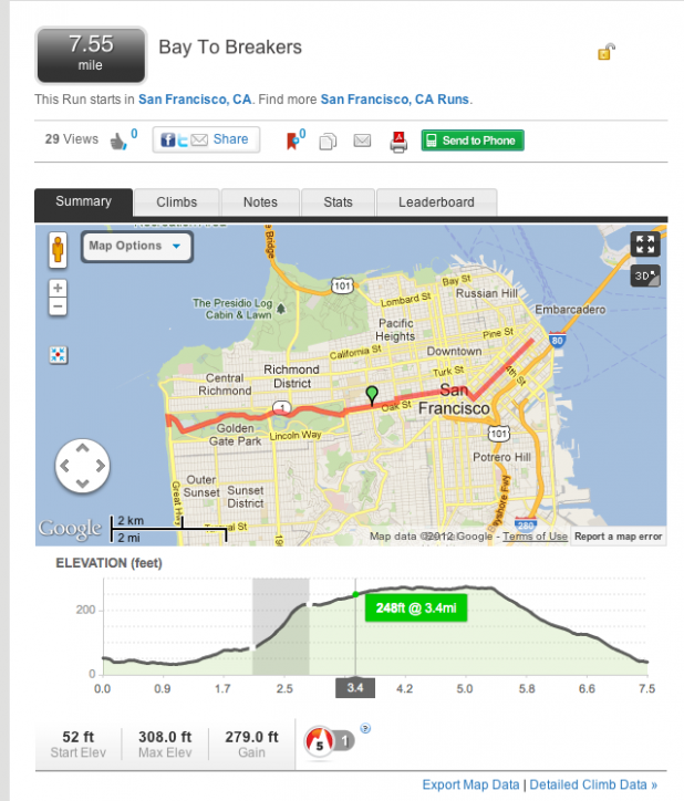 Thanks to the interactivity, I was able to find out that the worst of the climb lasts for only 0.7 miles and… well, it doesn’t look that bad, does it? But then I headed over to “Detailed Climb Data” and…
 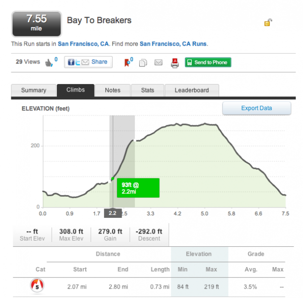 … Holy smokes, it’s Mount Everest! How do people even climb that thing without oxygen masks? Drama, drama. I decided to check another app, which I use religiously, to track my runs – and which we recently featured in a blog post on apps that visualize fitness data: RunKeeper.com. This is the elevation map provided by RunKeeper.
 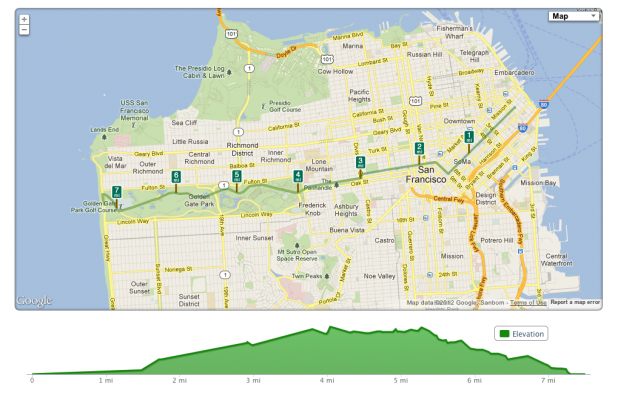 OK, so that isn’t that bad, is it? As you can see, the X axis, which represents miles, stretches out to scale with the map. Those 7.5 miles look much “longer” than the 7.5 miles visualized in the elevation map at MapMyRun, and the inclines look much less steep.
And here’s the thing: if you’ve never run Bay to Breakers or anything like it, the mental game starts the second you start comparing these charts. It’s not just about the raw numbers—the anticipation, the “can I really do this?” jitters, that stuff gets in your head. Looking at two different elevation profiles that seem to be describing entirely different beasts, it’s almost like the race exists in two separate dimensions. If you’re like me and already overthink everything, this is just another rabbit hole to tumble down the day before an event. One chart whispers, “You’ve got this!” and the next one’s shouting, “Call your mom and say goodbye.”
But honestly, when you get out there and the crowd is wild—people in gorilla suits, running with tortillas, the whole city buzzing—it does something to your sense of dread. Somewhere around mile four, you sort of forget about the “data” and just go, mostly on adrenaline and peer pressure. I wonder if that’s why the hills always feel a little easier than they look in those intimidating graphs. Or maybe it’s just denial, which, for runners, is as essential as stretching. Maybe that’s the big secret: none of the charts really matter after the first mile or so anyway.
What gives? Why are the two maps so different? I turned to my colleague Drew Skau, who not only has extensive knowledge of the art and science of data visualization, but is always willing to share it, often by writing for this blog. He told me that the devil is in the scale. Both visualizations have a fixed vertical pixel height for their graphs, but neither gives accurate elevation profiles. The charts have been made to fit to the space they have been allocated on the webpage. So if the chart is 50px tall by 600px wide, that’s what the space used to scale the charts. In both cases, that’s problematic. In both visualizations, the Y axis uses a different scale than the X axis. Brutal as those San Francisco hills are, we are certainly not going to climb one mile up, then go one mile down. In fact, the elevation change for the Bay to Breakers race is only 279 feet. This means that in a 600px wide chart, we only need a little over 4px to show the vertical change. That wouldn’t just look tiny, Drew says, “it would look like nothing.” If you want to actually see the slope you will be climbing up or descending, you have to visualize elevation using the same scale as distance, and clearly that can be a problem for a race that’s 7.5 miles long. Unless you create a chart that scrolls horizontally for a long, long time, you will have trouble visualizing long runs properly. The longer the race, the flatter its elevation chart would look — and that could give you a completely wrong idea of how easy your race would be. The solution, for a runner, would be to lace up a day or two before the race and do a quick walk through the course, or those parts of it that seem questionable on the elevation charts. Or, you could do like me and, after several hours of staring at different charts and maps, decide to wing it, after all. Just hold on to your breakfast! Aleksandra Todorova is the Editorial Director at Visual.ly. She runs an average 20 miles a week on the flat trails of South Bay and has mixed feelings about hills.Frequently Asked Questions
Why can an elevation profile make a hill look easier than it is?
An elevation profile depends on the relationship between vertical gain and the full route distance. When a long route is squeezed into a small chart, sharp climbs can appear flatter than they feel underfoot. Checking the scale, the climb length and the detailed ascent data gives a more useful picture of effort.
What should a runner inspect besides the elevation graphic?
A runner should compare route distance, climb segments and detailed ascent data, then walk sections that remain questionable. The article uses its 0.7-mile climb to show why a single chart can hide the effort of a short ascent. That extra check adds context before an apparently gentle profile is treated as an easy course.
How does comparing route tools improve planning?
Different tools may present the same route with different chart scales, labels and climb details. Comparing them reveals where a visual presentation hides uncertainty or exaggerates it. The useful outcome identifies the hard section and its duration, then shows which details need closer inspection.

Read more
-
Marketing
From Meta to Cara: Where Artists Reclaim Their Creative Freedom
What Is Cara? “Cara is a social media and portfolio platform for artists.” Straightforward, right? That’s how they define themselves on Cara’s “about” page. In response to the spread of generative AI, Cara aims to filter out AI-generated images, providing a space where genuine human creativity can be easily found and appreciated. The platform (in […]
-
Marketing
Reddit: Why You Should Keep an Eye on This Ever-Growing Platform
Discover why Reddit is the go-to platform for real-time insights and discussions. With a unique community-driven structure, Reddit offers a space for users to explore diverse topics. Learn how the Google-Reddit deal enhances its influence and what it means for marketers in our in-depth analysis.
-
Marketing
Interactive Product Demo: The Selling Power Behind the Strategy
A good interactive product demo is an impactful way to interest consumers in your best products. Here’s a closer look at what today’s marketers need to know to get them just right.