Telemetry Uses Data Visualization to Take Race Cars to the Next Level
TL;DR
Motorsport telemetry turns sensor floods into pit-side coaching. Cars can stream tens of thousands of readings per second, then teams chart speed, g-forces, and friction circles to improve the next lap.
- Why it matters: A one-hour race can generate well over 8 million data points for real-time decisions.
- How it works: More than 100 sensors can feed gears, throttle, brakes, temperatures, and pressures to analysts.
- Case in point: RaceCapture's 24 sensors at up to 100 Hz illustrate the enthusiast kit path.
- Reality check: After-race overlays reveal braking and throttle differences winners exploit.
- The bottom line: Visualize trends with sparklines and friction circles, then coach drivers as the cheap upgrade.
Motorsport is one of the world’s most popular spectator activities, and one of the most data-heavy. While the average three-hour baseball game can generate three million data points, a one-hour car race can generate well over 8 million. All these data points are the result of telemetry systems that can use more than 100 sensors on each car to generate read-outs of information, including gears used, throttle and brake application, g-forces and the temperature and pressure of various car components. In all, it is possible for a car’s sensors to transmit more than 10,000 readings per second that are then relayed in real time to a team of analysts in the pits, who use the data to make recommendations to the driver.
RaceCapture, a telemetry system that serves racing enthusiasts, uses 24 sensors that can each report data up to 100 times per second — or, as mentioned above, more than 8 million data points generated in an hour. “Combining the data from sensors together can create virtual channels,” Fred Schechter of Autosport Labs, the maker of RaceCapture, wrote in an e-mail. “With these virtual channels we can contextualize data and create a bigger picture of what’s happening on the track for the driver and the vehicle.” When looking at a screen of the RaceCapture software in action, you might see something like the image to the right. “Those colored lines are the X-yellow, Y-red, and Z-blue accelerometer values respectively,” wrote Schechter. “These indicate which way the car would be “pitching”. In other words, when Y changes its going from acceleration to deceleration, and vice versa.” The main green line represents the speed of the car. Smaller charts monitor the car’s safety and health, including heat and pressure ratings, then allow the team to adjust the car accordingly. With these kinds of measurements, Schechter writes, “We often use sparklines to be able to see trends in combination with a live gauge to identify the current status.”
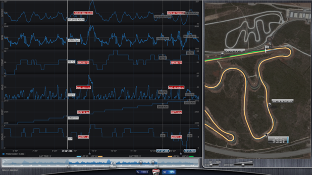
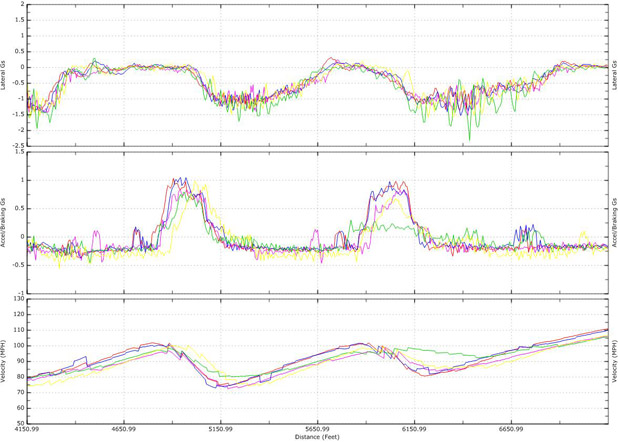
While much of these data are needed immediately to keep a driver safe and successful on the track, much more is downloaded after the race for review. Looking at a visualization of the data after a race can help drivers learn how they can improve for the next race. “Faster race car drivers are one of the most inexpensive upgrades a race team can have that many people simply overlook in the desire for the latest speed parts,” writes Schechter. Overlaying two telemetry charts can offer insight into the minute differences in braking and acceleration that allow winning drivers to get the edge.
Even if someone has never driven a racecar, it’s easy to see how addictive this sort of data could become. Plenty of amateur racing leagues and even some spirited track day clubs have started to rely on these telemetry setups to coach newcomers or just settle a few arguments. You might think it’s just about shaving fractions of a second off a lap, but more often, it’s about bragging rights in the paddock – who braked latest, who really committed to the corner, that kind of thing.
What’s interesting is how some drivers interpret the very same data completely differently. One person’s tidy telemetry trace is another’s missed opportunity; where an engineer sees a hesitant throttle, a driver might argue it was the “right” amount given the car’s feel that day. The numbers are objective, but honestly, the storytelling around them gets as creative as anything you’ll hear at a bar after the race. There’s almost an art to reading between the digital lines.
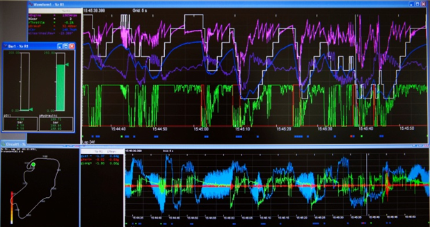
Traqmate, another telemetry system writes in its user manual that “often you can get a quick idea of a driver’s skill by simply looking at their Friction Circle plot. 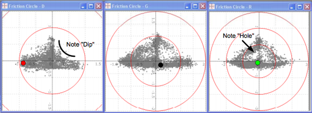 These charts measure braking and steering. When a plot looks like the one on the left, almost like a playing piece in a game of “Sorry!”, the dips indicate it is braking, then turning: an amateur move. The expert driver on the right has almost all of their data points around the perimeter of the triangle. Different telemetry systems produce different outputs, ranging from simple to complex and beautiful, though all are strictly utilitarian. ATLAS, or Advanced Telemetry Linked Acquisition System, is one of the most popular systems among F1 racing teams. Developed by McLaren Electronic Systems, the software can display images like this:
  While telemetry systems used to be priced exclusively for the pros, kits like RaceCapture and Traqmate make data visualization for the racing geek (or maybe even racing for the data visualization geek) available for the individual consumer.
Frequently Asked Questions
What do pit analysts typically watch in a live stream?
The article lists gears, throttle and brake application, g-forces, and component temperature and pressure among the readouts that matter in the moment. Those channels are relayed so crews can recommend changes while the car is still on track and conditions keep shifting. Treat the live feed as safety plus performance coaching rather than a highlight reel for spectators.
How do virtual channels help drivers see the bigger picture?
Fred Schechter of Autosport Labs is quoted that combining sensors creates virtual channels that contextualize what is happening on track for driver and vehicle. Accelerometer axes are described as showing pitch between acceleration and deceleration beside a green speed line. Use combined channels when a single gauge hides the story behind a lap.
What does an amateur friction circle usually look like?
Traqmate's manual is cited for plots that dip like a Sorry piece when a driver brakes, then turns, instead of loading the perimeter smoothly. Expert traces keep more points around the edge of the triangle where grip is used together. Coaches can use that shape as a fast skill screen before arguing raw lap times in the paddock.
Which systems does the piece name beyond RaceCapture?
It mentions Traqmate for consumer kits and ATLAS from McLaren Electronic Systems as a popular Formula One stack used by teams. Outputs range from simple utilitarian charts to denser professional displays with many overlays. Pick complexity based on whether you need coaching clarity for amateurs or pro-team depth for race engineers.

Read more
-
Marketing
From Meta to Cara: Where Artists Reclaim Their Creative Freedom
What Is Cara? “Cara is a social media and portfolio platform for artists.” Straightforward, right? That’s how they define themselves on Cara’s “about” page. In response to the spread of generative AI, Cara aims to filter out AI-generated images, providing a space where genuine human creativity can be easily found and appreciated. The platform (in […]
-
Marketing
Reddit: Why You Should Keep an Eye on This Ever-Growing Platform
Discover why Reddit is the go-to platform for real-time insights and discussions. With a unique community-driven structure, Reddit offers a space for users to explore diverse topics. Learn how the Google-Reddit deal enhances its influence and what it means for marketers in our in-depth analysis.
-
Marketing
Interactive Product Demo: The Selling Power Behind the Strategy
A good interactive product demo is an impactful way to interest consumers in your best products. Here’s a closer look at what today’s marketers need to know to get them just right.