How Groups Stack Up: When to use Grouped vs. Stacked Column Charts
TL;DR
Grouped and stacked column charts answer different questions: grouped bars compare individual series, while stacked bars show totals and composition. The article explains percentage stacks and why colors, ordering and category count affect readability.
- Why it matters: The chart type determines whether readers can compare individual values, whole-group totals or relative composition without extra calculation.
- How it works: Grouped columns share a baseline for each series, while stacked segments accumulate to form one total for each group.
- Reality check: A stack makes comparison between segments harder because only the first series shares the same visual baseline.
- Case in point: Use a percentage stack when relative share matters more than volume, and a grouped chart when individual values drive the decision.
Bar and column charts are one of the most frequently used chart types. They are simple to understand, simple to make, and their visual structure matches the structure of a lot of data.
They also have two variations that can be really useful for slightly more complex data structures. Grouped and stacked column charts are great ways to indicate other relationships in the structure of data, but there are subtle differences between what each one communicates, and using the right chart can make a big difference.
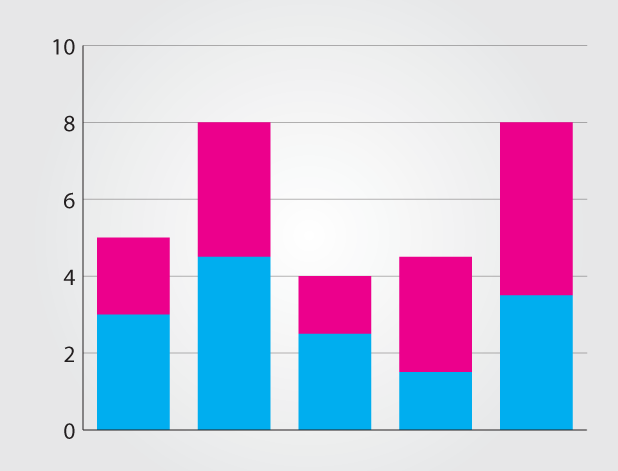
Grouped bar charts are good for comparing between each element in the categories, and comparing elements across categories.
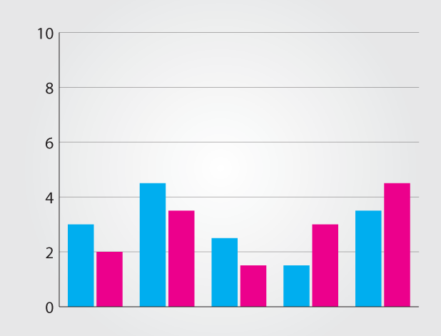
The grouping makes it harder to tell the difference between the total of each group though. This is where stacked column charts come in. They are great for showing the total because they visually aggregate all of the categories in a group. The downside is that it becomes harder to compare the sizes of the individual categories. Stacking also indicates a part to whole relationship.
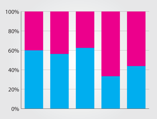
There is another type of stacked column, the stacked percentage column. In this version, the total quantity is hidden by using percentages, but it’s easier to see the relative difference between quantities in each group.
People sometimes forget that chart color also plays a part in interpretation. If your stacked columns use shades that are too similar, readers might gloss over the distinctions—especially if they’re just glancing for a quick answer (which, let’s be honest, is how most folks look at charts anyway). On the flip side, too many bold colors can end up looking like a preschool mural, so striking that balance matters more than you’d think. Also, if someone prints your chart in grayscale, suddenly all those careful gradients are out the window.
Software quirks are another thing worth a quick gripe. Programs like Excel or Google Sheets make it easy to whip up these charts, but sometimes the default settings don’t do you any favors. The automatic axis scaling or the order of the stacked categories can subtly warp the story your data is telling. You might spend longer than you planned just nudging things around so the chart finally does what you meant in the first place. Little details, but in 2025, most readers expect a certain polish.
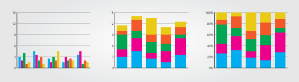
All of these charts works particularly well for data with only two or three categories per group. Too many categories per group add visual noise, making it hard to see the patterns in the data.
There are a lot of options and small details, so deciding which to use can be tricky. The best way to pick the right one is to think first about the data. If there is no part to whole relationship (maybe there is overlap in the categories), then grouped is definitely the option you want to use. If there is a part to whole relationship, then the next question to ask is what relationship is the most important to show. If the goal is to show sizes between individual categories, use a grouped column or bar chart. If the goal is to show the total sizes of groups, use a regular stacked bar chart. If the goal is to show relative differences within each group, use a stacked percentage column chart.
Drew Skau is Visualization Architect at Visual.ly, and a PhD Computer Science Visualization student at UNCC with an undergraduate degree in Architecture. You can follow him on twitter @SeeingStructure
Frequently Asked Questions
When should I use grouped columns instead of stacked columns?
Use grouped columns when the decision depends on comparing individual values across categories. The article explains that each series gets a shared baseline, making differences easier to see. This is useful when you need to compare one product, channel or segment with its counterpart in another group. If the whole-group total or the composition of that total is the primary question, a stacked chart provides a more direct view.
What does a stacked percentage chart show?
A stacked percentage chart normalizes every group to the same total and emphasizes how each segment contributes to the whole. The article describes it as useful when relative differences matter more than quantity. It can reveal a change in mix even when groups have very different volumes. Pair it with another view when readers also need to know the actual total, because the normalized chart intentionally hides that difference.
How can I make a grouped or stacked chart easier to read?
Limit the number of series, choose colors that remain distinct, order categories deliberately and label the question the chart answers. The article warns that too many categories create visual noise and that similar shades can obscure differences. Check how the chart works in grayscale or on a smaller screen. If a reader must decode the legend repeatedly before finding the pattern, simplify the chart or choose a different form.

Read more
-
Marketing
From Meta to Cara: Where Artists Reclaim Their Creative Freedom
What Is Cara? “Cara is a social media and portfolio platform for artists.” Straightforward, right? That’s how they define themselves on Cara’s “about” page. In response to the spread of generative AI, Cara aims to filter out AI-generated images, providing a space where genuine human creativity can be easily found and appreciated. The platform (in […]
-
Marketing
Reddit: Why You Should Keep an Eye on This Ever-Growing Platform
Discover why Reddit is the go-to platform for real-time insights and discussions. With a unique community-driven structure, Reddit offers a space for users to explore diverse topics. Learn how the Google-Reddit deal enhances its influence and what it means for marketers in our in-depth analysis.
-
Marketing
Interactive Product Demo: The Selling Power Behind the Strategy
A good interactive product demo is an impactful way to interest consumers in your best products. Here’s a closer look at what today’s marketers need to know to get them just right.