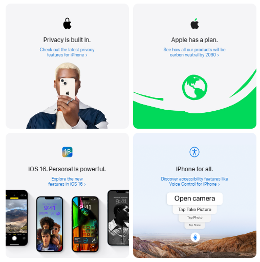
Apple Uses Interactive Content To Leverage The New iPhone 14 Launch Campaign

TL;DR

Apple backed the iPhone 14 launch with interactive product pages that respond as shoppers explore colors, video demos, and CTAs. Apple Newsroom dated the iPhone 14 and 14 Plus introduction to September 7, 2022.

  • Why it matters: Wikipedia defines interactive media as experiences that change with user input, which is the engagement loop the article highlights.
  • How it works: The body walks through color reveals, videos, interactive infographics, animations, and purchase CTAs on each device page.
  • Zoom in: IxDF (updated 2026) says interaction design focuses on how people use a product beyond the object alone.
  • Reality check: The polish only holds when transitions stay smooth; lag breaks the story the page is selling.
  • The bottom line: Use interaction to teach features in sequence, then point a clear CTA at the next step.

Apple… you love it or you hate it. But you can’t deny that they are keeping up with the current Marketing trends. The company has always expressed itself with beautiful Marketing campaigns, not only by the messaging, colors and images, but with the whole offline and online experience.

Last September 7th, the California Based company hosted a big event to announce its brand new iPhone 14 models, the Apple Watch 8, the second generation of the Airpods Pro and other products.

To increase awareness and boost user experience, Apple launched an entire online interactive experience for each new device. You may know that interactive content is one of the most recent content formats and delivers amazing results by generating more engagement, making information more accessible and increasing the chances of conversions, so let’s see how Apple is doing it.

Neste post 2

Apple’s interactive experience

The interactive landing page is full of resources for the user to really engage with the content and, of course, learn everything about the devices presented. Let’s see these resources in detail below.

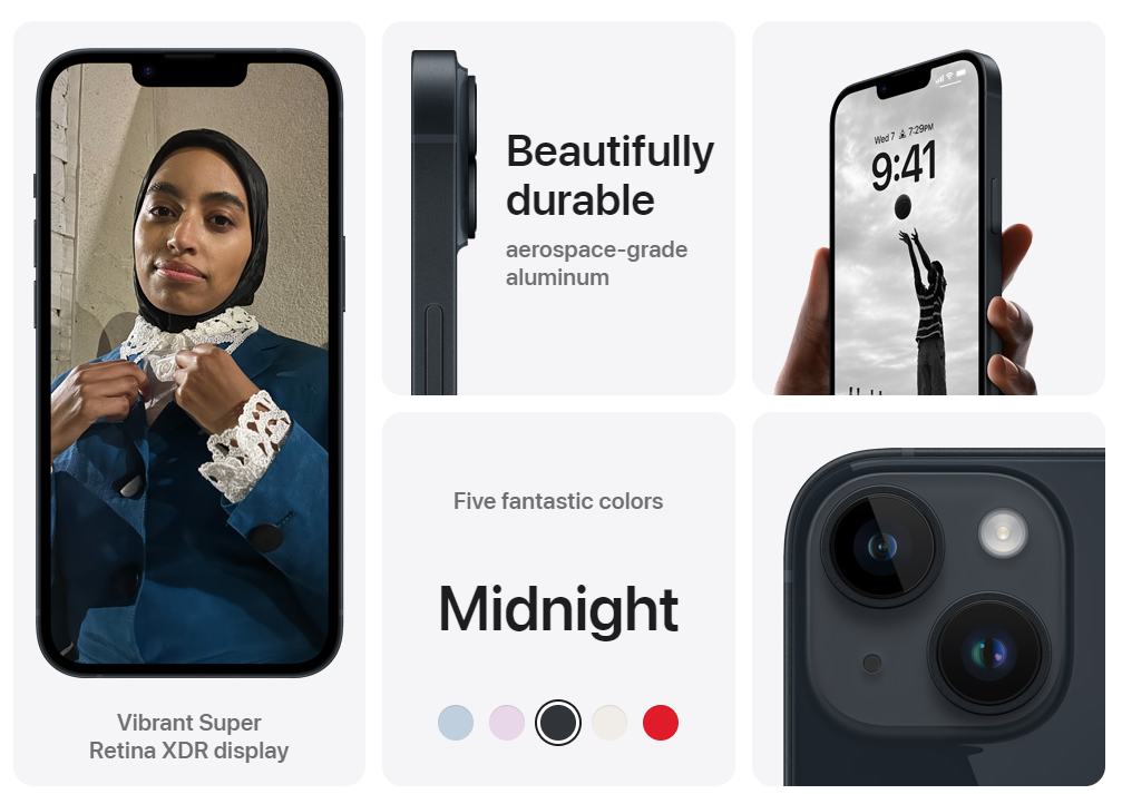
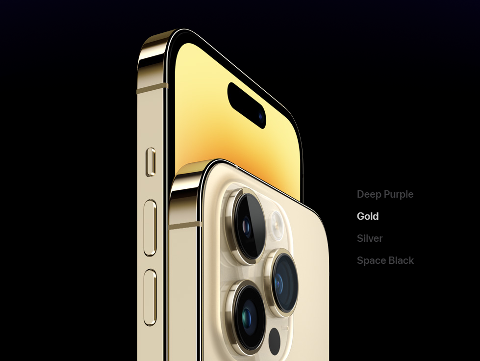
Displaying Color Options:
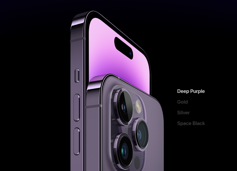
There is no need to open a new page or open new images to see all the options. By adding hidden images or cards to reveal, it is possible to encourage the user to discover new possibilities.

On the iPhone page, just click on the color you want to see and then it changes. 

Videos
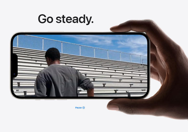
Apple combined short texts with beautiful videos with rich information or examples to deliver a content that is interesting to see while transmitting the intended message. With interactive pages, it is also possible to display examples, demos and case studies, just like Apple did with the new camera system.

Here’s something that often gets overlooked: the way Apple manages to wrap technical details in storytelling, so you end up learning about a new lens or processor and hardly notice the specs just slipped into your memory. There’s a certain confidence in their pacing, like they know you’ll pause and replay if it feels important. It’s clever, especially for people who aren’t tech enthusiasts but care just enough to want the “why” before the “how.” At the end of a product video, you’re not just sold a feature – you remember the feeling you got while watching it, whether it’s curiosity, surprise, or (let’s be honest) a small burst of envy.

This level of interactivity might seem over the top at first — until you realize how conditioned we all are, at this point, to expect instant feedback and smooth transitions. Try clicking through Apple’s experience on a jittery Wi-Fi connection, and any little hiccup feels like someone dropped a glass in a library: jarring. They’ve invested in making those moments seamless, and when other brands skip that polish, it’s suddenly obvious. Smooth, responsive design keeps you in the story instead of yanking you back into “wait, what’s going on?” territory.

Interactive Infographics
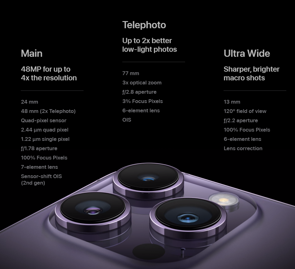
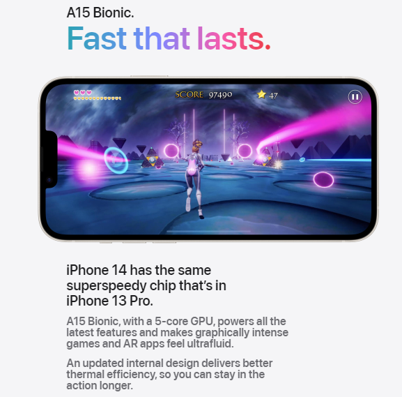
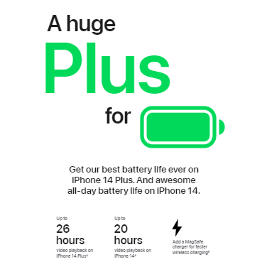
Interactive infographics are all over Apple’s pages. They help catch the attention of the audience with digestible content, especially when it comes to data and complex information.

When delivering detailed nurturing content, an infographic will not only keep people engaged and help them understand what you are willing to share. It also helps with comparisons, since infographics are able to create visual differentiation between brands and features, while nurturing with high-value content.

Animations
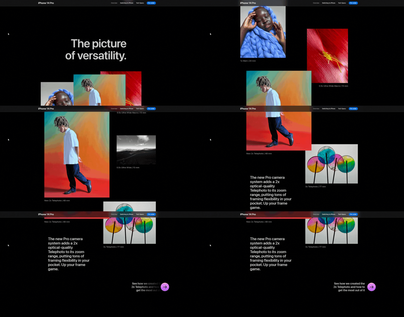
Animations are not just beautiful. Okay, they look pretty, but they slide the audience through the content and help them take action. At the same time, they direct their attention to where you want them to be on the page and highlight information displayed.

CTAs
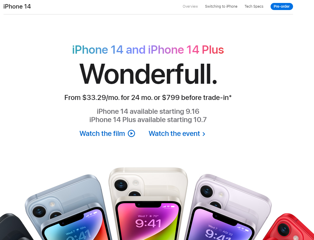
Just like any other content, you can add call-to-actions on interactive pieces and encourage readers to make a purchase, for example. Apple explores it and invites people to know more about the products, detailed videos and order their devices online. Let the imagination flow and add the CTAs where the content connects to the offer!

Interaction makes it better

Alright! The iPhones look beautiful, the watches and airpods look amazing but what catches the most is how their content is delivered. 

Apple’s Marketing campaigns are beautiful, and using interactive experiences makes it even more valuable. They are able to show all the features that their devices boast and create a narrative that engages the user and makes them want to buy the product.

This is what interactive content stands for: attract, engage and convert a lot more. 

Frequently Asked Questions

What is interactive content in a product launch?

It is content that changes based on what the visitor does, instead of a static page they only scroll. Wikipedia describes interactive media as digital experiences that respond to user input with text, images, animations, video, or audio. IxDF adds that interaction design studies user needs and contexts beyond device specs alone. Apple's launch pages used that pattern so shoppers could explore features before buying.

How did Apple use interactive content for iPhone 14?

The article says Apple launched online interactive experiences for each new device after the September 7 event. On the iPhone page, color chips swap the shown phone, short videos carry camera and chip stories, and infographics break down complex details. Animations guide attention down the page, and CTAs invite deeper videos or online orders. Apple Newsroom confirms the same-day iPhone 14 and 14 Plus introduction.

Which interactive elements does the article call out?

Five patterns: displaying color options without leaving the page, product videos that wrap specs in story, interactive infographics for comparisons, animations that steer attention, and CTAs that push toward more detail or purchase. Together they model attract, engage, convert. Treat the roster as a checklist for product storytelling, not as a guarantee that every brand needs the same level of polish.

Why does interaction help more than a static brochure page?

Participation keeps people in the narrative while they learn. Wikipedia's definition centers on output that comes from user input, which matches Apple's color taps and demo plays. IxDF's 2026 note stresses designing for how people will interact, including limits like slow connections. When feedback is instant, technical details feel easier to absorb; when it stutters, attention snaps back to the friction.

MM Matt Montenegro