12 Visualizations That Will Change the Way You View Scale in Your World
TL;DR
Extreme scale is hard to feel, so this piece walks through 12 visualizations that zoom from Powers of Ten and The Scale of the Universe to DNA, geologic time, internet traffic, and xkcd charts like Gravity Wells and the Radiation Dose Chart.
- Why it matters: without comparison frames, trillion-dollar or atomic figures stay abstract noise.
- Case in point: Eames' Powers of Ten and Huang's interactive Scale of the Universe make zoom tangible.
- Zoom in: Karl Tate's elevation graphic and Drew Berry's DNA piece cover Earth extremes and the tiny.
- Reality check: visualizations invite understanding; they do not magically make huge numbers intuitive.
- The bottom line: borrow a comparison structure, then map your data to a human-scale anchor.
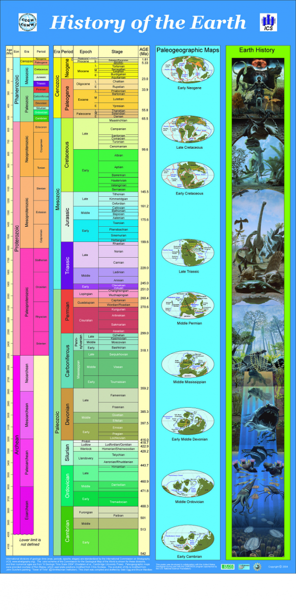
Scale is a simple concept. From a very early age, children know about big and small, heavy and light, more and less. Extreme scales, however, are another story. Try to imagine, for example, the size of the universe… or $1 trillion made up entirely of dollar bills. Exactly. Grasping the actual quantities involved in extreme scales can be difficult, which makes managing scale in visualizations an interesting problem. Below are 12 visualizations that try to show things at extreme scales. 1. The classic visualization describing change of scale is the Powers of Ten video by Charles and Ray Eames. 2. A newer version of a very similar visualization is The Scale of the Universe by Cary and Michael Huang. This version has an interactive slider and lets you scroll through the zoom levels yourself. 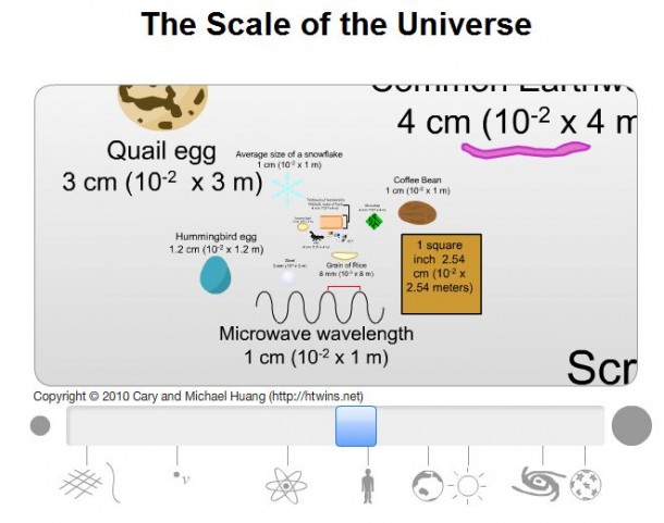 3. Scale by Brad Godspeed focuses on the scale of objects in our solar system. 4. The Known Universe expands even further out, showing real data for known objects in our universe. 5. Here on Earth, there are still massive distances to quantify. Tallest Mountain to Deepest Ocean Trench by Karl Tate shows the full range of elevations that humans can get to. To help emphasize the range, the height of the infographic is to scale, accurately portraying relative differences between each elevation. 6. Extremely tiny sizes are also hard to grasp. The beginning of Molecular Visualizations of DNA by Drew Berry does a great job of showing the minuteness of DNA wrapped up into chromosomes. 7. Physical size is not the only quantity that can be hard to conceptualize because of huge scales. Aside from the eye-watering color selection, History of the Earth does a good job of showing the geologic time periods that our planet has gone through from the Cambrian period onward.
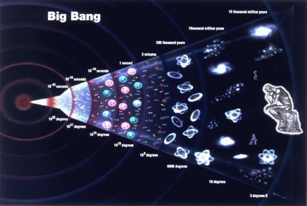
  8. For even more extreme time scales, Big Bang shows both the time scale and the temperature of the universe as it expanded.
  9. Computers have also gone through extreme scale changes in terms of what they can process and store. Global Internet Traffic addresses some of these scale changes.
 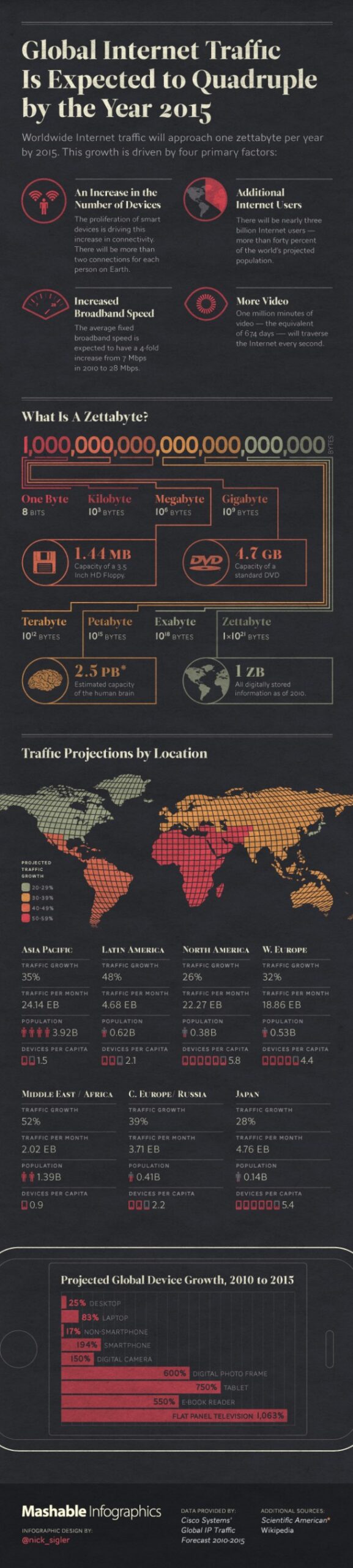 Infographic originally published on Mashable.com.
Once you start digging into these visualizations, you realize how much our sense of scale is shaped by daily life. We sort of just... ignore the extremes most days because they're irrelevant to getting groceries or catching a train. But the moment you zoom way out or in, everything normal feels weirdly insignificant. There's this mental leap, where your brain tries to hang onto familiar comparisons—like, "That's how many Earths could fit into Jupiter?"—but it honestly never quite feels like enough. I mean, show me a football field versus a bacterium and my mind just gives up.
A similar thing happens when numbers get too big or small. You can toss around figures like the national debt or the number of stars in the Milky Way, but picturing them? That's another story. Visualizations aren't perfect at solving this, but at least they invite you to try. They slow you down a bit, force you to stare at a sea of dots or a spiraling graphic, and maybe—if you're paying attention—you get a fleeting sense of the bigness or smallness involved. It's not magic, but it's as close as most of us are going to get to understanding these extremes firsthand.
10. xkcd’s creator, Randall Munroe seems to enjoy visualizations of scale. Gravity Wells shows the scale of gravity on different planets.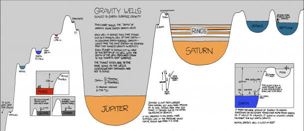 11. After the 2011 earthquake and tsunami in Japan, Munroe created the Radiation Dose Chart to show quantity of a completely intangible substance, radiation.
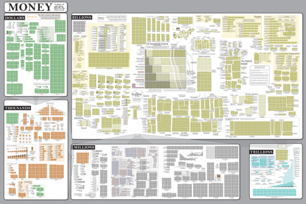
 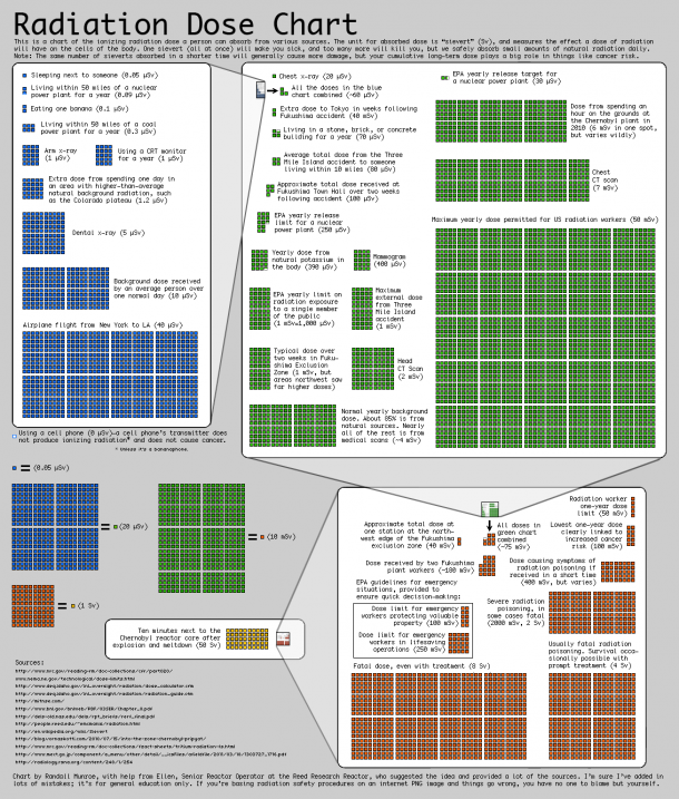 12. Prompted by all the recent economic turmoil, Munroe visualized some of the quantities involved in Money. Both of these charts use a cool technique where the units in each section are defined using the units in the previous section. This produces a logarithmic scale, and it gives a good frame of reference for how huge these values actually are.
  Humans all fit within a small range of sizes, weights, and lifespans, and the quantities we deal with typically fit in small ranges as well. But, as our understanding of the world around us grows, and our society becomes larger, we encounter increasingly extreme quantities. Thankfully, visualization will always be there to help us grasp these extremes! Drew Skau is a PhD Computer Science Visualization student at UNCC, with an undergraduate degree in Architecture.
Frequently Asked Questions
What is a good starting example for teaching scale?
The article opens with Powers of Ten by Charles and Ray Eames, then The Scale of the Universe with an interactive slider. Those two establish zoom as a narrative before denser charts. Use them when your audience needs intuition before raw units.
Which examples cover intangible quantities like radiation?
Randall Munroe's Radiation Dose Chart, included as item 11, visualizes radiation doses in the 2011 Japan earthquake and tsunami context. Gravity Wells likewise scales an invisible force across planets for comparison. Keep both as communication aids for scale rather than as clinical or engineering limits.
Can these visualizations replace a formal data model?
No. The article frames them as ways to grasp extremes rather than as analytical systems of record for operations. Pair a memorable comparison with the actual units your decision still needs in a table or model. If a chart only dazzles without decision data, it is decoration.

Read more
-
Marketing
From Meta to Cara: Where Artists Reclaim Their Creative Freedom
What Is Cara? “Cara is a social media and portfolio platform for artists.” Straightforward, right? That’s how they define themselves on Cara’s “about” page. In response to the spread of generative AI, Cara aims to filter out AI-generated images, providing a space where genuine human creativity can be easily found and appreciated. The platform (in […]
-
Marketing
Reddit: Why You Should Keep an Eye on This Ever-Growing Platform
Discover why Reddit is the go-to platform for real-time insights and discussions. With a unique community-driven structure, Reddit offers a space for users to explore diverse topics. Learn how the Google-Reddit deal enhances its influence and what it means for marketers in our in-depth analysis.
-
Marketing
Interactive Product Demo: The Selling Power Behind the Strategy
A good interactive product demo is an impactful way to interest consumers in your best products. Here’s a closer look at what today’s marketers need to know to get them just right.