12 Ice Cream Infographics
TL;DR
Twelve ice cream infographics for National Ice Cream Month cover consumption, gelato, weird flavors, ingredients, health, and DIY. IDFA still marks July under the 1984 Reagan designation; Ice Cream Day is July 19 in 2026.
- Why it matters: designers get ready visual angles on a seasonal food story without starting from a blank artboard.
- The big picture: topics run from country and US regional consumption to color palettes and DIY.
- Zoom in: entries include a bacon sundae calorie burn and a Rome gelato flowchart.
- Reality check: some live image files are broken; use captions as the index while assets are repaired.
- The bottom line: treat the twelve as a mood board and fact-check any chart before you republish numbers.
Summer is heating up in the northern hemisphere, and July is national ice cream month in the US. Designers and infographic creators everywhere love ice cream, and it’s evident through all the infographics they’ve created. There is a full range of topics to cover on ice cream, from consumption, to ingredients, to colors. As a tribute to the mouthwateringly good chilled cream, here is a list of twelve ice cream infographics.
- Ice cream is a delicious treat for hot weather that almost everyone loves, but there may be a lot of stuff you don’t know about ice cream.
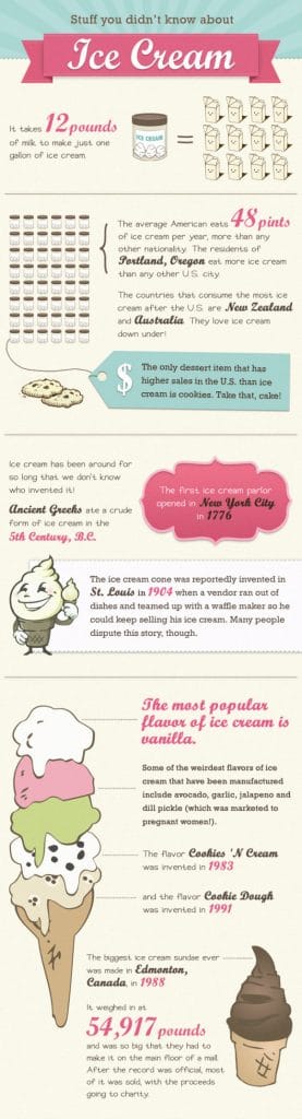
Stuff You Didn’t Know About Ice Cream infographic
2. Not everyone consumes the same amount of ice cream, and some countries consume more than others. Check out which countries consume the most in Global Annual Ice Cream Consumption.
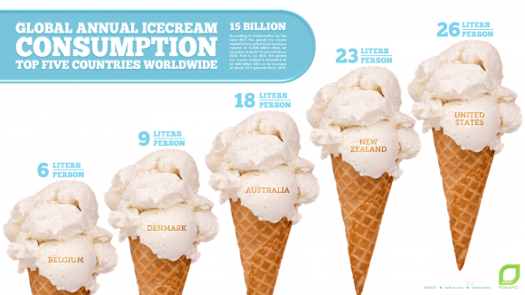
Global Annual Ice Cream Consumption: Top Five Countries Worldwide infographic
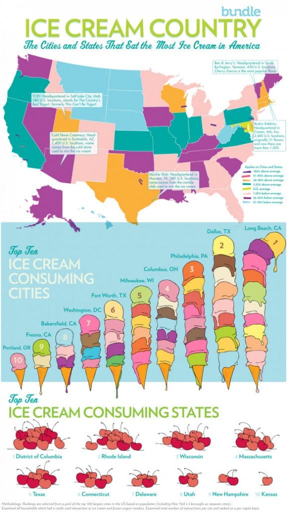
3. Speaking of ice cream consumption, it varies among different regions in the United STates, as well. Ice Cream Country highlights the top ice cream consuming cities and states.
4. Ice cream isn’t the only frozen treat, of course. Gelato is a great frozen snack.

Good Day for Gelato infographic
5. And if you can’t pick what flavor of gelato you want, try this flow chart of the Gelato of Rome

6. You could also make similar decisions for ice cream based on what you are doing next.
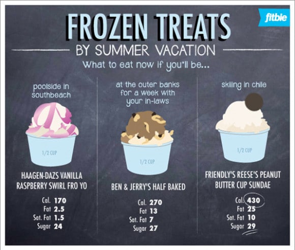
Frozen Treats infographic by LindsaySnowOsborn.
7. Ice cream comes in all colors, and some designers have used that as inspiration. Retro Ice Cream shows some color palette options based on ice cream colors.

Retro Ice Cream Colour Palette infographic by wond.
8. It also comes in some pretty strange flavors. 10 Weird Ice Cream Flavors shows ten of the strangest.
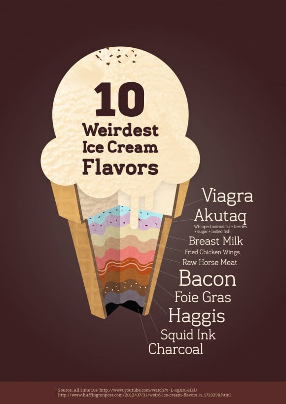
10 Weirdest Ice Cream Flavors infographic
9. Another strange flavor is a Bacon Sundae. The (perhaps genius) concoction is 510 calories, and takes a five mile run to burn off.

Burn Off that Bacon Sundae infographic by LindsaySnowOsborn.
10. With all those strange flavors, you may be wondering, What’s in that Ice Cream?
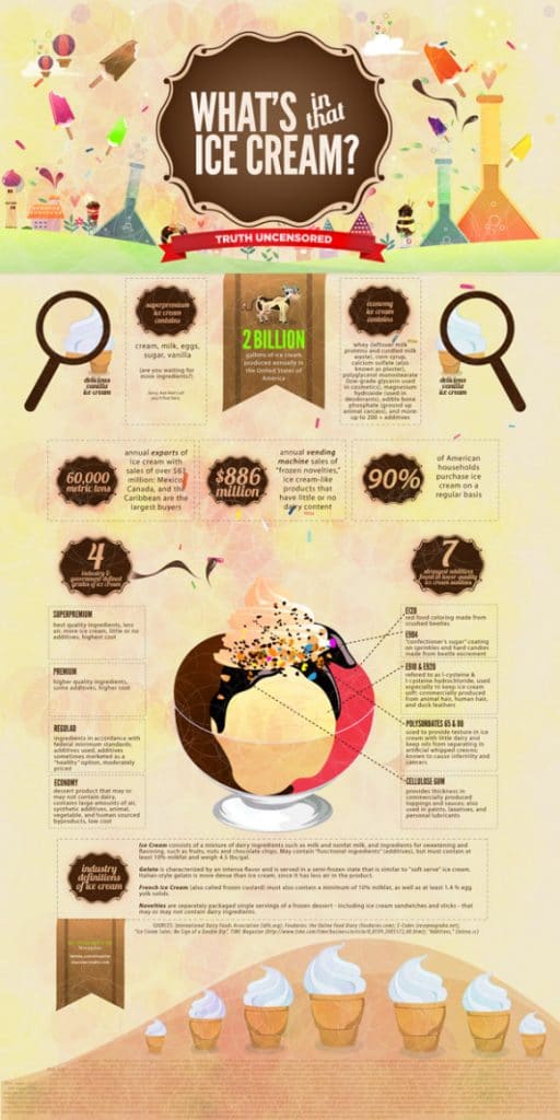
What’s in that Ice Cream? infographic
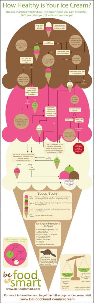
11. The ingredients, of course, directly impact the Health of Your Ice Cream.
People get surprisingly intense about their favorite brands and flavors—it’s almost like a regional loyalty thing, bordering on sports rivalry energy if you ask me. Just look at how locals in Texas fiercely defend Blue Bell, or the way New Englanders will go to bat for their quirky independent dairies. Toss in some experimental vegan joints in LA or Brooklyn, and suddenly you’ve got a whole new world of debate with people standing in line for oat-milk soft serve like it’s the next big sneaker drop. Actually, the commitment is kind of endearing, if a little dramatic.
And while we’re here talking about the health angle, there’s this ongoing tug-of-war between indulgent classics and all those lighter, “healthier” pints flooding grocery stores. The popularity of stuff like Halo Top (remember how everyone lost it over that for a solid year?) keeps growing, even though die-hard fans will quietly admit it’s just not the same as the real-deal, full-fat stuff. Maybe it’s about nostalgia, or maybe just about actually enjoying your dessert—who knows. Whatever side you fall on, the infographics seem to keep pace with all the new spins and trends, updating just as fast as people’s cravings change.
How Healthy is Your Ice Cream infographic
12. If you want total control over the ingredients and how healthy your ice cream is, you could always Make Your Own Ice Cream!
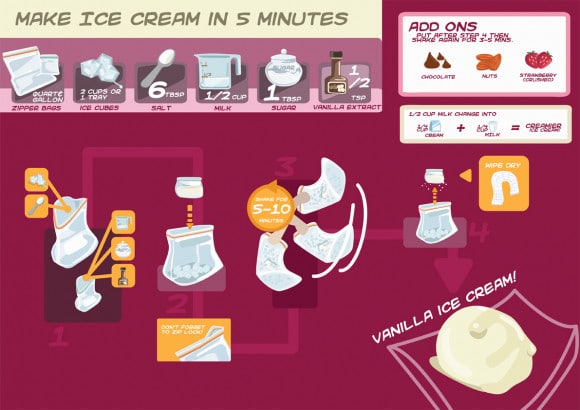
How to Make Ice Cream In 5 Minutes infographic
Here’s to a nice big bowl of melt-in-your-mouth, tongue chilling, brain freezing ice cream! Drew Skau is Visualization Architect at Visual.ly and a PhD Computer Science Visualization student at UNCC with an undergraduate degree in Architecture. You can follow him on twitter @SeeingStructure
Frequently Asked Questions
What is National Ice Cream Month and when is Ice Cream Day in 2026?
The article hangs the list on July as National Ice Cream Month in the United States. IDFA explains that President Ronald Reagan designated July for the month and the third Sunday for National Ice Cream Day in 1984. For 2026, IDFA says National Ice Cream Day falls on Sunday, July 19. Use the observance as a publishing calendar hook rather than a sales forecast.
What topics do the twelve ice cream infographics cover?
Across the list you get global and US consumption snapshots, gelato explainers, flavor decision charts, retro color palettes, weird flavors, a bacon sundae workout callout, ingredient and health explainers, and a quick homemade method. The piece is a curated index of separate creatives rather than one merged dataset. Skim titles first, then open only the visuals that match your story angle.
Can I reuse these infographics in my own marketing?
The post is a showcase of third-party creatives rather than a license to reuse the art. Assume you need permission from each original publisher before republishing artwork. You can still study layout patterns: hierarchy, palette, and how a chart turns a niche fact into a shareable frame. When in doubt, redraw with your own data and cite primary sources.
How should designers work from a seasonal food gallery like this?
Pick one job per asset: consumption geography, flavor discovery, ingredient transparency, or make-at-home steps. Pair the visual with a current primary source if you quote a number, because several charts here are older. Keep brand voice adult and specific; ice cream does not need cutesy chrome. Ship one strong graphic with a clear takeaway instead of twelve weak remakes.

Read more
-
Marketing
From Meta to Cara: Where Artists Reclaim Their Creative Freedom
What Is Cara? “Cara is a social media and portfolio platform for artists.” Straightforward, right? That’s how they define themselves on Cara’s “about” page. In response to the spread of generative AI, Cara aims to filter out AI-generated images, providing a space where genuine human creativity can be easily found and appreciated. The platform (in […]
-
Marketing
Reddit: Why You Should Keep an Eye on This Ever-Growing Platform
Discover why Reddit is the go-to platform for real-time insights and discussions. With a unique community-driven structure, Reddit offers a space for users to explore diverse topics. Learn how the Google-Reddit deal enhances its influence and what it means for marketers in our in-depth analysis.
-
Marketing
Interactive Product Demo: The Selling Power Behind the Strategy
A good interactive product demo is an impactful way to interest consumers in your best products. Here’s a closer look at what today’s marketers need to know to get them just right.