12 Great Visualizations That Made History
TL;DR
Historic data visualizations shaped how we understand the world, from cave paintings showing star patterns to John Snow cholera maps that changed public health.
- Why it matters: Breakthrough visualizations like Snow cholera maps and Nightingale sanitation charts saved lives by revealing hidden patterns.
- The big picture: William Playfair invented pie charts, bar graphs, and line charts that became fundamental tools for communicating numbers.
- By the numbers: Over 10,000 copies of slave-trade engravings spread a message that had only been conveyed orally.
- Reality check: Simple visual patterns often trigger major scientific breakthroughs by making invisible connections obvious.
- The bottom line: Today heatmaps and infographics may lay groundwork for future medical and environmental discoveries.
Most visualizations end up as passing follies that are significant in the short-term, but in the long-run they fade to the background with the rest of the noise. Occasionally, though, some visualizations end up in a perfect position to play a significant role in culture and history. Here are a few that have been fortunate enough to become significant.
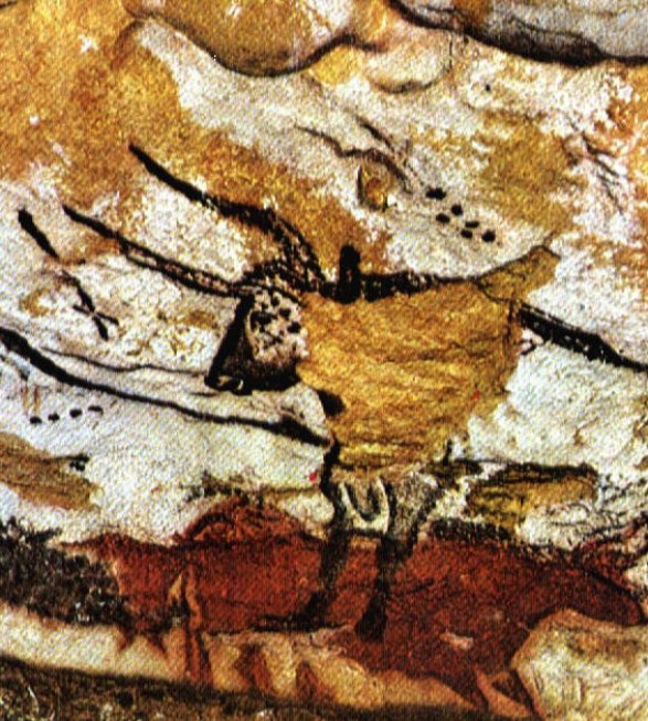
1. One of the earliest known visualizations is a map. The famous Lascaux caves in France contain paintings on their walls that date from the paleolithic period. One particular painting shows three stars known as the Summer Triangle. These three stars, Vega, Deneb and Altair, were bright in the sky. The images around them may suggest ideas of constellations, ways to help remember the star patterns and navigate.
2. The trans-atlantic slave trade was one of the most despicable things people have done to other people. Transport conditions were especially bad, but at the time the public did not know much about the process. The Description of a Slave Ship engravings gave people a visual sense of what had previously only been conveyed orally. Over 10,000 copies of the engravings were created in under a year, giving strong support to the antislavery movement.


3. There are rare people in history who have contributed more to visualization than anyone else. William Playfair is one of these people. He is responsible for creating pie charts, bar graphs, and line and area charts. These charts are commonplace today, but imagine being the first person to create one and seeing how powerful they can be to help communicate numerical information.
This image is of the first pie chart ever produced. At the time, visually depicting a part-whole relationship was a novel idea.

4. Playfair’s bar charts were inspired by timeline visualizations produced by Joseph Priestly and by a lack of detailed data.

5. This line chart is especially interesting because Playfair showed that it is not just the lines themselves that convey meaning. The interaction between the lines also shows information.

6. Of all of the visualizations in this post, Charles Minard’s map of Napoleon’s March is probably the most famous. Edward Tufte singled it out as “the greatest statistical graphic ever“, pushing it into the public consciousness. Whether it really is the greatest ever or not, this image does a great job of showing the miserable failure of the march, and the correlation with really cold weather.

7. Today we know that cholera is spread through water, but in the early 1800s people weren’t sure. John Snow’s cholera map helped to show that contaminated wells were at the center of outbreaks. His research helped save countless lives and set the foundation for the field of epidemiology.

It’s funny how the simplest visuals, like Snow’s map, can trigger such a huge shift in thinking. You picture those black marks for deaths clustered around that single water pump, and suddenly a pattern emerges from what used to look like just random tragedy. This wasn’t just a science breakthrough, it was a communications one. To be honest, most of the world’s progress is built on moments where someone shows us what was always just out of sight.
Sometimes the importance of a visualization doesn’t show up right away. Think about all the little diagrams, scrappy annotated maps, and doodled models that collected dust for years before someone bothered to look twice—then, wham, something clicks. The stats and infographics we share today might look quaint or even irrelevant to the class of 2125, but, who knows, maybe something as mundane as a heatmap is laying the groundwork for the next big medical or environmental leap.
8. Another lifesaving visualization came from Florence Nightingale. Nightingale was a nurse during the Crimean War and was also very adept at statistics. Her reports to British parliament contained chart types that she invented, the Coxcomb Plot. These charts helped to prove to parliament that sanitation was important to the survival rate and that the Royal Commission that she had convinced them to start was helpful.

9. If something moves so fast that you can’t see it clearly, how do you know exactly what it is doing? Today, we would use a high speed camera to take slow motion video, but in the 1700s that technology didn’t exist. Most visualizations so far involved capturing information over a long period of time and condensing it into a single digestible image. Eadweard Muybridge‘s work does the opposite. As challenged by Leland Stanford, Muybridge took photos of a horse moving so quickly it was difficult to see. The series of photos effectively “slowed down” the motion so that people could tell that a horse does indeed lift all four legs off the ground during a gallop.

10. It isn’t very often that people are aware they are making history while they are making it, but Richard Grumm and his team probably had a pretty good idea. They were the team in charge of the tape recorder on the Mariner 4 probe sent to Mars. The recorder was set to record the data from the television camera on the probe before transmitting the data back home. If all went well, the transmitted images would be the very first up close pictures of Mars! Unfortunately, once the data was received, it would take computers hours to turn the numbers into an image so Grumm and his team decided to hand color the data stream as it was printed out on ticker tape, just like a paint by number painting. The resulting image is red purely by coincidence, but the resemblance is remarkable.

11. One really interesting task in visualization is to try to show something to extra-terrestrial life. How do we know they can see, let alone understand abstract drawn representations of real things? Despite the assumptions involved in undergoing a task like this, Pioneer 10 and 11 were both fitted with gold plaques depicting information about the craft, the species that created it, and where it came from. The spacecraft are still on their journey today, well past the edges of our solar system by now!

12. With the increasing prominence of computers in doing statistical work in the 1970s, the typical output of computers was all numerical. Francis Anscombe challenged this norm and argued that computers should also output charts and graphs to help people understand the numbers they were crunching. In order to support his argument, he created a set of numbers known now as Anscombe’s Quartet. These numbers have identical statistical qualities (mean, variance, correlation, linear regression) but there are definite patterns shown in each set. Without visualization these patterns are hard to spot.

Drew Skau is a PhD Computer Science Visualization student at UNCC, with an undergraduate degree in Architecture.
Frequently Asked Questions
How did John Snow cholera map change public health?
Snow plotted cholera deaths around London water pumps in the early 1800s, revealing contaminated wells as outbreak centers. This visualization helped establish that cholera spreads through water, shifting how cities approached disease prevention and sanitation. The map became foundational evidence for modern epidemiology and saved countless lives by changing public health policy. Study the map layout to see how spatial plotting turned scattered deaths into actionable insight.
What makes Charles Minard Napoleon visualization so famous?
Minard map combines multiple data dimensions in one image: troop numbers, geographic movement, temperature, and time during Napoleon Russian campaign. Edward Tufte called it the greatest statistical graphic ever because it tells a complete story of military disaster through visual design. The visualization shows how a massive army dwindled to a fraction of its original size, making the campaign failure immediately comprehensible. Compare Minard layered encoding with your own dashboards to see how one graphic can carry several variables.
Why did William Playfair chart innovations matter so much?
Playfair created the first pie chart, bar graph, and line chart in the late 1700s, inventing visual methods we use daily. Before his work, numerical data was only presented in tables, making patterns difficult to spot. His charts revolutionized how people communicate statistics by showing relationships visually and easing mental comparisons. Rebuild one Playfair chart type with your own dataset to practice translating tables into clear graphics.
How do historic visualizations influence modern data science?
Early visualizations established core principles still used today: showing patterns over time, revealing spatial relationships, and making complex data accessible. Anscombe Quartet from the 1970s proved that identical statistics can hide different patterns, emphasizing visualization continued importance. Even mundane heatmaps today may inspire breakthroughs for a class of 2125, as the article suggests. Curate a small gallery of historic examples to train your team on design choices that still matter.

Read more
-
Marketing
From Meta to Cara: Where Artists Reclaim Their Creative Freedom
What Is Cara? “Cara is a social media and portfolio platform for artists.” Straightforward, right? That’s how they define themselves on Cara’s “about” page. In response to the spread of generative AI, Cara aims to filter out AI-generated images, providing a space where genuine human creativity can be easily found and appreciated. The platform (in […]
-
Marketing
Reddit: Why You Should Keep an Eye on This Ever-Growing Platform
Discover why Reddit is the go-to platform for real-time insights and discussions. With a unique community-driven structure, Reddit offers a space for users to explore diverse topics. Learn how the Google-Reddit deal enhances its influence and what it means for marketers in our in-depth analysis.
-
Marketing
Interactive Product Demo: The Selling Power Behind the Strategy
A good interactive product demo is an impactful way to interest consumers in your best products. Here’s a closer look at what today’s marketers need to know to get them just right.